What is Typography?
Typography is the art of arranging type to enhance the readability and visual appeal of written language. It involves selecting and styling fonts, determining font sizes, adjusting spacing, and organising text hierarchies to convey information effectively.
Typefaces and Fonts
A typeface refers to a consistent design for characters, such as letters and symbols, with examples like Times New Roman or Helvetica. A font is a specific instance of a typeface, characterised by attributes like size and style; for instance, "Times New Roman 12pt Bold" where "Times New Roman" is the typeface, "12pt" is the size, and "Bold" is the style. Glyphs are individual symbols within a font, encompassing letters, numbers, punctuation, and symbols.
Serif Typefaces
Serif typefaces are characterised by small decorative strokes or embellishments at the end of letter strokes.
- Old-Style serifs
- Old-Style serifs, like Garamond and Bembo, have an organic and calligraphic design inspired by Renaissance Roman and Greek lettering. They feature modulated stroke width, gradual curves in bracketed serifs, low stroke contrast, open apertures, and an angled stress resembling handwriting.
- Transitional serifs
- Transitional serifs, such as Times New Roman and Baskerville, exhibit increased stroke contrast, more pronounced bracketing, vertical stress, and moderate aperture openings, combining the organic design of old-style serifs with the geometric precision of modern ones.
- Modern serifs
- Modern serifs, like Bodoni and Didot, have high stroke contrast, a vertical orientation, and a rational, geometric design suitable for display purposes.
- Slab serifs
- Slab serifs, like Rockwell and Clarendon, feature bold, blocky serifs with consistent width, conveying a modern and sturdy aesthetic. Clarendon is a hybrid between transitional and slab serif styles, while Geometric slab serifs have uniform stroke width and a geometric, monolinear appearance.
Sans-serif Typefaces
Sans-serif fonts, characterised by the absence of decorative strokes at the ends of letters, convey a modern and clean aesthetic. There are several key categories within sans-serif fonts.
- Neo-Grotesque
- Neo-Grotesque fonts, exemplified by Helvetica and Arial, feature clean and simple designs with consistent stroke widths, offering a versatile and straightforward appearance suitable for various design applications.
- Humanist
- Humanist fonts, like Gill Sans and Optima, draw inspiration from calligraphic forms, emphasising warmth and organic design. With open letterforms and varied stroke widths, they provide a more human touch and enhanced readability, making them suitable for both display and body text.
- Geometric
- Geometric fonts, such as Futura and Avant Garde, are based on geometric shapes, providing a modern and minimalistic aesthetic with clean lines and simple designs. These fonts are popular choices for contemporary designs and branding.
Script Typefaces
Script typefaces, designed to mimic cursive or handwritten styles, exhibit flowing and connected characters reminiscent of traditional handwriting, calligraphy, or brush lettering. Script fonts, including examples like Lobster and Pacifico, add elegance, personality, or informality to text. These fonts can range from formal and elegant to casual and playful, catering to diverse design needs.
Font Pairing
Effective font pairing involves selecting fonts with contrasting styles, like pairing a serif with a sans-serif or combining a script font with a geometric one, to generate visual interest. Beyond style, consider the characteristics of each font, including weight, style, and proportions, aiming to pair fonts with differences while sharing certain visual qualities for harmony. Establishing a hierarchy in design by using fonts with distinct weights or styles for headlines, subheadings, and body text guides the reader through the content.
When choosing fonts, consider the mood or tone you wish to convey; classic serif fonts evoke a formal or traditional feel, while sans-serif fonts offer a modern and clean look. Limiting the number of fonts to two or three ensures a cohesive and polished appearance, while exploring fonts from the same typeface family provides variation with a consistent touch. Additionally, fonts with similar x-heights, representing the height of lowercase letters, tend to pair well, contributing to a harmonious overall look.
Typographic Scales
Typographic scales serve as a design system, establishing a harmonious and organised hierarchy of font sizes to enhance the readability, scannability, and aesthetics of content. The base font size, typically set for body text, acts as the starting point for the scale, ensuring optimal readability. Scale increments, defined by modular or proportional steps, follow ratios like the golden ratio (1.618) or simple multiples (1.2, 1.5, 2, etc.), contributing to a cohesive visual structure. The concept of vertical rhythm, representing consistent spacing between lines of text, is integral to a well-designed typographic scale, incorporating line heights that harmonise with chosen font sizes.
Whitespace
Whitespace, also known as negative space, serves as a powerful design tool in typography by providing empty or unused space between and around elements. Thoughtful use of whitespace enhances readability, guides attention, contributes to aesthetics, and positively influences user experience. In both print and digital media, whitespace is crucial for preventing information overload, allowing the viewer's eyes to rest and facilitating easier absorption of information.
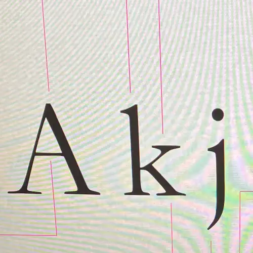
Anatomy of Typography
Here's are some key terms and elements of typography:
- Baseline
- The imaginary line upon which the base of characters sit.
- X-Height
- The height of lowercase letters, measured from the baseline to the top of lowercase letters without ascenders.
- Ascender
- The part of a lowercase letter that extends above the x-height, as seen in letters like "h" or "d".
- Descender
- The part of a lowercase letter that extends below the baseline, as seen in letters like "p" or "g".
- Cap Height
- The height of uppercase letters, measured from the baseline to the top of uppercase letters.
- Stem
- The main vertical stroke in a letterform, such as in "l" or "H".
- Bowl
- The curved, enclosed part of a character, as seen in letters like "b" or "d".
- Counter
- The enclosed space within a letterform, as seen in letters like "o" or "e".
- Terminal
- The end of a stroke that does not include a serif, as seen in the top of the letter "f".
- Kerning
- The adjustment of space between individual characters.
- Tracking
- The adjustment of overall spacing between groups of characters.
- Leading
- Also known as line spacing or line height, it refers to the vertical space between lines of text.
- Baseline Shift
- The vertical adjustment of a character above or below the baseline.