What is a Logo?
A logo is a distinctive graphic mark, emblem, symbol, or stylised name used by organisations or individuals to establish a unique brand identity, fostering instant recognition. Designed for memorability, effective logos are characterised by their relevance to the business, simplicity, and versatility across various mediums.
Logo Categories
Logos come in various types, each serving a unique purpose in visually communicating a brand's essence.
- Logomark
- A logomark is a visual symbol or icon that represents a brand. It serves as a visual shorthand, helping people quickly identify and remember the brand without the need for accompanying words. Examples include Nike and Apple.
- Logotype
- A logotype, also known as wordmark, is a company's name or a distinctive arrangement of letters designed in a specific way to represent a brand. Examples include Coca-Cola and Google.
- Monogram Logo
- A monogram logo is a design created by combining two or more letters, typically the initials of a person, company, or brand, into a single, unique symbol. Examples include Louis Vuitton and BMW.

- Emblem, Seal or Badge
- An emblem, seal, or badge is a visual design that combines images and text to create a distinctive symbol representing an organisation, authority, or group. It typically consists of a central image surrounded by text or other decorative elements. Examples include Harley-Davidson and Starbucks.
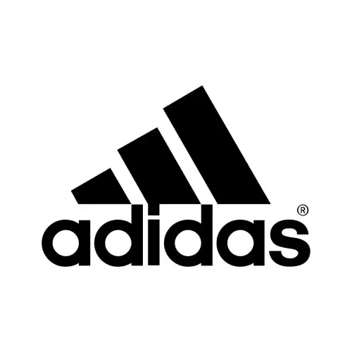
- Combination Mark
- A combination mark is a type of logo that combines a logotype with a distinct symbol or icon. Famous examples of combination marks include the logos of companies like Adidas, Starbucks, and Burger King, where the combination of both text and a distinctive symbol contributes to the overall brand identity.
Logo Styles
Logo styles refer to the visual and design approaches that contribute to the overall aesthetic and feel of a logo.
- Flat Design
- Flat design logos leverage straightforward shapes and vector graphics to evoke depth, favouring solid colours over gradients, blurs, or drop shadows.
- Handwritten Type
- Brands and businesses seeking an authentic and relatable image often gravitate toward illustrative, script, and hand-drawn logos.
- Geometric
- Geometric logos employ fundamental shapes to craft intricate patterns, offering a versatile style that can range from sleek simplicity to intricate ornateness.

- Gradient Ovelay
- Gradient or Gradient Overlay logos leverage gradients and blending modes to craft a sophisticated layered appearance, making them ideal for emanating a practical, vibrant vibe that captures attention.
- Crest
- Crest style logos are a good way to organise logos that need many lines of type including an established date, maybe a subline, or byline and a main company name. Accompanying symbols can also be used in a crest to further explain the companies mission.

- Negative Space
- A negative space logo is a design where the space around and between the main elements is deliberately used to create a secondary image or meaning. This technique is often employed to convey clever and hidden messages within the logo.
Colour
Understanding colour psychology is essential when designing a logo to ensure it effectively communicates the intended message and resonates with the target audience.
- Red
- In logos, red is often employed by brands to stand out, create a sense of importance, or stimulate a strong emotional response from the audience. It is frequently used in industries such as food, technology, and retail.
- Orange
- Orange is commonly used in logo design to convey warmth, enthusiasm, and friendliness. Its bold and lively nature makes it effective for brands aiming to evoke a sense of optimism and approachability. Orange is commonly used in beverages and the food industry.
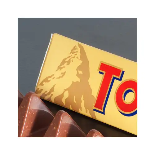
- Yellow
- Yellow, while a vibrant and attention-grabbing colour, is often considered challenging in logo design for several reasons. Its brightness can be overpowering and lead to visual fatigue if overused. Additionally, yellow can be less legible, particularly in small or intricate designs, making it a less practical choice for certain applications. Despite these challenges, when used thoughtfully and in combination with other colours, yellow can bring warmth, positivity, and energy to a logo design.
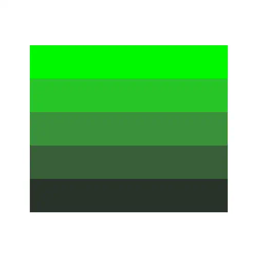
- Green
- Green is strongly associated with nature, growth, and freshness, making it a versatile option for environmentally conscious brands, health and wellness companies, and those promoting sustainability. Green is also known for its calming and harmonious qualities, which can evoke a sense of balance and trust.
- Cyan
- Cyan is a bright and refreshing colour that often evokes feelings of clarity, cleanliness, and innovation. It is commonly associated with technology, communication, and a modern aesthetic. Cyan can be particularly effective in logo designs for industries such as electronics, software, and telecommunications.
- Blue
- Blue is the most commonly used colour in logo design for several reasons. Firstly, blue is often associated with positive qualities such as trust, reliability, and professionalism. Its calming and universally liked nature makes it a safe and versatile choice for a wide range of industries.
- Purple
- Purple is associated with qualities like royalty, luxury, sophistication, and creativity and is often chosen by beauty, cosmetic, hospitality and creative industries to evoke a sense of luxury and individuality.
- Pink
- Pink has positive associations with qualities like femininity, sweetness, and playfulness, it also carries cultural and gender-related stereotypes that might not align with the branding goals of certain businesses. Additionally, pink can be seen as less versatile in conveying a sense of professionalism or seriousness compared to more neutral or traditional colours. This perception can limit its application in industries where a more formal image is desired. However, when used thoughtfully, pink can be effective in industries like fashion, beauty, and certain creative sectors where its unique qualities align with the brand's identity and target audience.
- Multicolours
- Multicoloured logos are popular in various industries, including technology, entertainment, and creative sectors, where they can convey a sense of diversity, innovation, and energy.
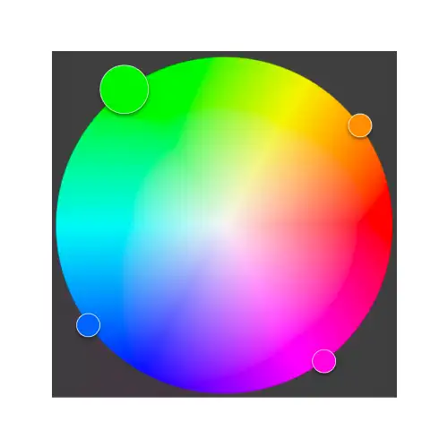
Colour Harmony
Various colour harmonies are employed to create visually appealing and effective logos.
- Monochromatic
- This harmony uses different shades, tones, and tints of a single colour. It creates a clean and minimalist look, often conveying simplicity and sophistication.
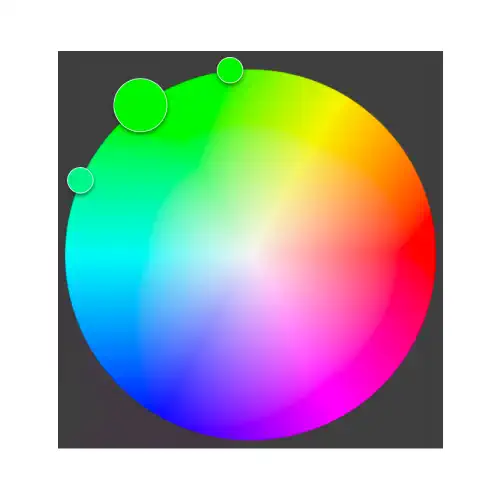
- Analogous
- Analogous colour schemes involve colours that are next to each other on the colour wheel. This harmony is often chosen for a cohesive and harmonious feel.
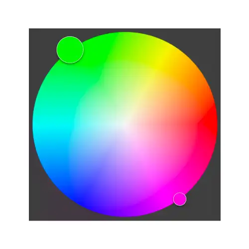
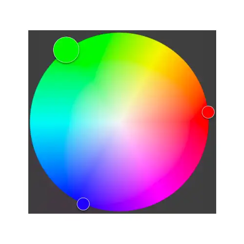
- Complementary
- Complementary colours are opposite each other on the colour wheel. Using these pairs in a logo design can create high contrast and make elements stand out.
- Split-Complementary
- This harmony is a variation of the complementary scheme. It involves a base colour and two adjacent to its complementary colour. It provides high contrast while maintaining colour richness.
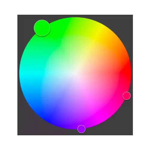
- Triadic
- Triadic colour schemes use three colours evenly spaced around the colour wheel. This provides a balance of contrast and variety, often resulting in vibrant and dynamic logos.
- Tetradic
- Tetradic (Double-Complementary) colour schemes involve four colours, in the form of two complementary colour pairs. This provides a rich colour palette and can be used for more complex designs.