What is a Logo?
A logo is a simple visual mark that helps people recognise a brand quickly. On the web, a good logo needs to be clear at different sizes, work on light and dark backgrounds and stay readable on everything from mobiles to large screens. Strong web logos are usually simple, flexible and easy to scale.
Types of Logos
Different logo types behave differently online, so it helps to understand the basics.
Logomark
A logomark is an icon or symbol that represents a brand without text. These are especially useful online because they work well in favicons, app icons and small UI elements.
Logotype (Wordmark)
A logotype uses the brand name as the logo. It relies on clear typography and works best when the name is short enough to stay readable across devices.
Monogram
Monogram logos use one or more initials. They’re helpful when a full brand name is too long for small digital spaces.
Combination Mark
A combination mark pairs a logotype with a symbol. This is one of the most adaptable options for the web, as the full version can be used on large screens while the symbol alone works for icons and small components.
Logo Styles
These are common styles used in digital branding.
Flat Design
Flat logos use clean shapes and solid colours. They scale well, load quickly and stay crisp on high-resolution screens.
Geometric
Geometric logos use simple shapes to create strong, balanced designs. They’re reliable choices for modern digital branding.
Gradient / Colour Blended
Gradients can give a digital-first feel, but need careful use to stay accessible and readable at smaller sizes.
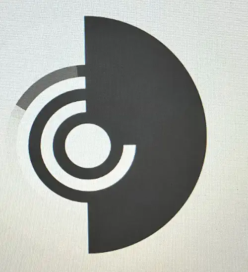
Negative Space
These designs use the space around or inside shapes to add extra meaning. They can look very smart online when executed well.
Colour for Logos on the Web
Colour choices affect readability and accessibility, especially on digital interfaces. A few key ideas:
- Strong contrast helps the logo stand out on different backgrounds.
- Bright colours can lose detail when scaled small, so test carefully.
- A simplified colour palette is easier to adapt for icons, buttons and UI elements.
- Consider how your colours look in dark mode.
General colour cues:
- Red: energetic and bold
- Orange: friendly and warm
- Yellow: bright but can be hard to read if overused
- Green: calm and natural
- Cyan/Teal: clean and technical
- Blue: trustworthy and dependable
- Purple: creative and premium
- Pink: playful and expressive
- Multicolour: conveys diversity and modernity (common in tech)
Colour Harmony
A few simple harmony types that work well for digital branding:
Monochromatic
Variations of one colour. Clean and easy to apply across a site.
Analogous
Colours that sit next to each other on the wheel. Works well for subtle, unified designs.
Complementary
Opposite colours on the wheel. High contrast, good for bold call-to-action elements.
Split-Complementary
A slightly softer take on complementary colours, offering contrast without being too harsh.
Triadic
Three evenly spaced colours. Bright and balanced, but needs control to avoid visual noise.
Tetradic
Two complementary pairs. Gives range but can be hard to keep consistent.