What is Web Typography
Web typography is the practice of choosing and arranging type so that text is readable, accessible and visually clear on screens. It focuses on how fonts render across devices, screen sizes and browsers, and how spacing, hierarchy and contrast guide users through content.
Choosing Typefaces for the Web
- Use typefaces designed for screen use, as they offer better clarity and hinting.
- Stick to commonly supported web fonts or host your own using modern formats such as WOFF2.
- Choose fonts with a wide range of weights to create hierarchy without loading multiple families.
Serif and Sans Serif on Screens
- Sans serif fonts often perform well for body text on screens due to their clean shapes.
- Serif fonts can work well at larger sizes, such as headings, where fine details remain clear.
- Test both styles on mobile as well as desktop to ensure readability.
Font Pairing
Effective pairing helps create structure on a page.
- Pair contrasting styles, for example a serif heading with a sans serif body.
- Keep the number of fonts to two or three to reduce page load and maintain consistency.
- Choose fonts with similar x heights for a balanced feel.
- Adjust weights to build hierarchy rather than switching between many families.
Typographic Hierarchy and Scales
- Establish a clear hierarchy using consistent sizes for headings, subheadings and body text.
- Maintain readable body text, usually between 16px and 18px.
- Use modular scales, such as 1.2 or 1.333, to create predictable size steps. fileciteturn0file0
- Keep line height generous to improve legibility, especially on mobile.
Spacing and Layout
Whitespace is essential for comfortable reading.
- Use adequate spacing around paragraphs, headings and UI elements.
- Ensure line length stays within roughly 45 to 75 characters.
- Increase spacing on smaller screens to prevent the layout feeling cramped.
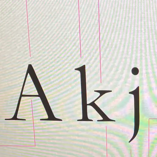
Key Typographic Terms
Understanding these helps when adjusting styles in CSS.
- Baseline the invisible line characters sit on.
- X height the height of lowercase letters without ascenders.
- Ascender part of a letter rising above the x height.
- Descender part of a letter falling below the baseline.
- Cap height height of capital letters.
- Kerning spacing between individual characters.
- Tracking overall spacing across a group of characters.
- Leading line height, or space between lines of text.
Practical Tips for Web Use
- Avoid very thin weights for body text as they can render poorly on some screens.
- Check text against accessibility contrast guidelines.
- Test fonts across browsers, particularly on mobile.
- Optimise font loading to reduce delays, for example by using
font display swap.